

How to Mix and Match Home Decor: 2026 Guide
Table of Contents
- Start With a Primary Style, Then Add a Secondary One
- How to Mix Patterns in Home Decor Without Visual Clutter
- Balancing Color Palettes in Interior Design With the 60-30-10 Rule
- Decorating With Different Textures for Depth and Dimension
- How to Mix and Match Home Decor on a Budget
- Room-by-Room Application: Living Room, Bedroom, and Dining Space
- Troubleshooting Common Mixing Mistakes
- Conclusion: Build a Curated Space That Evolves With You
- Frequently Asked Questions
Last Updated: September 14, 2026
Start With a Primary Style, Then Add a Secondary One
Learning how to mix and match home decor starts with one decision: pick a dominant style, then layer a secondary one on top. The primary style sets the foundation, roughly 70% of what a room contains. The secondary style supplies the contrast that keeps a space from looking like a showroom catalog.
This is where most people freeze. They buy pieces they love one at a time, then wonder why the finished room feels scattered. The fix isn't buying less, it's deciding the hierarchy before you shop.
A 2022 study in the Journal of Computational Design and Engineering analyzed pairings of colors, materials, and furnishings across eight interior styles and found that authentic combinations follow identifiable patterns rather than random mixing. In other words, cohesion has rules you can copy.
Here's how to apply them:
- Choose your primary style first (modern, traditional, cottage, industrial)
- Cap the secondary style at 30% of the room's visual weight
- Repeat one material or color from the primary style in every secondary piece
That last rule does the heavy lifting. A vintage brass lamp in a modern living room works because the room's black metal chandelier repeats the same metallic finish.
How to Mix Patterns in Home Decor Without Visual Clutter
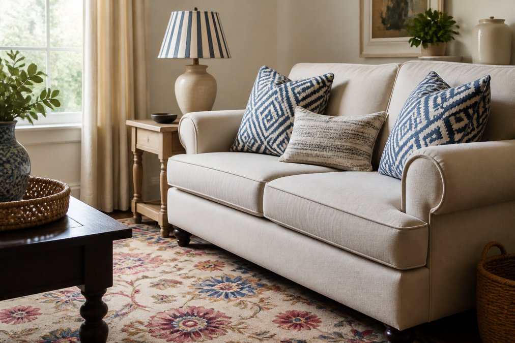
Mixing patterns works when you vary scale and hold the color palette steady. One large-scale pattern, one medium, and one small, all sharing at least two colors, reads as intentional. Three patterns at the same scale read as noise.
Start with a patterned anchor, usually a rug or a large textile, then pull two colors from it for everything else. A floral pillow and a geometric throw only fight when they share no common color.
- Large scale: area rug, curtains, upholstery
- Medium scale: throw pillows, lampshades, art
- Small scale: trim, borders, picture frames
Keep the total to three patterns per room. Four is where rooms start to feel busy, and the clutter is usually invisible until you're standing in it.
Balancing Color Palettes in Interior Design With the 60-30-10 Rule
Balancing color palettes in interior design comes down to proportion: 60% dominant color, 30% secondary color, 10% accent. The dominant color usually lands on walls and large upholstery, the secondary on curtains and case goods, and the accent on pillows, art, and small accessories.
The rule works because it mirrors how the eye reads a room. Large surfaces establish the mood, mid-size pieces add interest, and small accents give the eye somewhere to land.
For a Modern Cottage look, guidance from Thrifty and Chic's 2026 decor trend report recommends mixing at least three warm neutrals in a single room by layering textiles, finishes, and furniture rather than committing to one shade. Three neutrals give you a neutral base with depth instead of a flat, beige box.
| Layer | Share | Where It Goes | Example |
|---|---|---|---|
| Dominant | 60% | Walls, sofa, rug | Warm white walls, cream sofa |
| Secondary | 30% | Curtains, shelving, chairs | Sage green drapes, oak shelves |
| Accent | 10% | Pillows, art, hardware | Terracotta pillow, brass pulls |
Decorating With Different Textures for Depth and Dimension
Decorating with different textures is what separates a room that photographs well from one that feels flat in person. Aim for at least three textures per seating area: something smooth, something woven, and something soft or nubby.
Texture layering is also the cheapest way to add depth and dimension. You don't need new furniture, just a woven throw pillow cover, a velvet cushion, and a chunky knit blanket on the same sofa.
Material contrast does the same job on hard surfaces. Pair a matte ceramic vase with a glossy glass tray, or a rough stone coffee table with a smooth leather ottoman. A Woodgrain 2026 interior trend report notes that homeowners are moving away from the old rule that all wood finishes must match, which opens up far more options for mixing oak, walnut, and painted pieces in one room.
The one constraint: keep the wood tones within two shades of each other. A pale ash next to a deep espresso works. Pale ash next to orange-toned cherry usually doesn't.
How to Mix and Match Home Decor on a Budget
Budget-friendly mixing comes down to one principle: spend where the eye rests, save everywhere else. Accent pieces carry the styling, so that's where a small budget goes furthest. The mistake most people make is spreading a limited budget evenly across the room, which produces a space that looks uniformly inexpensive instead of intentionally layered.
A workable framework is to sort every purchase into one of three tiers before you buy:
- Investment tier (one per room): the piece the eye lands on first, a sofa, a rug, or a statement light. Buy the best version you can afford here, because this is what the rest of the room is judged against.
- Mid tier (two to four per room): case goods, chairs, lamps, and large textiles. Shop secondhand, outlet, or floor-sample here. Wood furniture hides wear far better than upholstery, so a used oak side table is a safer secondhand bet than a used armchair.
- Swap tier (unlimited): pillows, throws, vases, art, and hardware. This is where you change the room's read seasonally without touching the investment pieces.
Pillow covers are the highest-return purchase in the swap tier. A handwoven cover at $49.76 changes a sofa's entire read for a fraction of new upholstery, and you can rotate it seasonally without storing bulky inserts. Downtown5's handwoven throw pillow covers are a good example of the category: handwoven in India, sized 14x24 inches, and sold as covers only so you keep the inserts you already own.

Mixing high-end heirloom pieces with affordable modern finds is the specific skill most guides skip. The rule that makes it work: let the heirloom set the color and the affordable piece supply the contrast. A grandmother's walnut buffet reads as intentional next to an inexpensive matte-black console lamp because the lamp borrows the buffet's dark tone rather than introducing a new one. Reverse the logic, a cheap piece introducing a brand-new color, and the room reads as a mismatch instead of a mix.
A few more practical moves that stretch a budget without looking like it:
- Buy one statement piece per room, then fill in with neutral basics
- Shop secondhand for wood furniture, which hides wear better than upholstery
- Swap pillow covers instead of pillows to change a room's look seasonally
- Use peel-and-stick wallpaper on a single wall instead of repainting the whole room
- Repaint or re-stain hardware (cabinet pulls, lamp bases) instead of replacing fixtures
Room-by-Room Application: Living Room, Bedroom, and Dining Space
Each room tolerates a different amount of mixing, and the reason is function. A room where people gather and move around can absorb visual contrast; a room built for rest cannot. The living room can carry the most contrast because it's the most-used and most-styled space. Bedrooms want restraint. Dining rooms sit in between.
Living room, the highest-contrast room. Anchor with a neutral sofa, then layer two patterns and three textures. This is the room where an eclectic aesthetic pays off, and where a secondhand find usually looks best. A workable ratio is a 70/30 primary-to-secondary split, with the secondary style concentrated in one zone, a reading corner, a bar cart, a gallery wall, rather than scattered across the whole room. Concentrating the contrast gives the eye a place to rest and makes the mix look deliberate.
Bedroom, the lowest-contrast room. Keep the dominant style at 80% or higher. Bedding, curtains, and one accent chair in a secondary style is plenty. More than that and the room stops feeling restful. The mechanism is simple: the bedroom is where the eye needs the least to process, so pattern count should drop to one or two and texture should carry the interest instead. A linen duvet, a woven throw, and a single patterned pillow do more for a mixed bedroom than three competing prints.
Dining space, the transitional room. Mix the table and chairs deliberately. A traditional wood table with modern upholstered chairs is a classic transitional design move that reads as intentional rather than mismatched. The dining room is also the best place to repeat an element from an adjacent room, the same metal finish on a chandelier and a living room lamp, for example, because the two spaces are usually visible from each other and the repetition ties them together.
Hallway and entry, the bridge room. Often overlooked, but this is where a mixed home either holds together or falls apart. Keep the entry to two styles maximum and repeat one material from the living room so the transition reads as continuous rather than as a new decorating scheme.
One piece that works across all of these rooms: a [5-light black iron sphere chandelier(https://downtown5.store/products/q280-ab6lcic2808-5-light-modern-black-iron-sphere-modern-chandelier) | downtown5.store] at $138.87. The open cage design and vintage finish sit comfortably in industrial, cottage, and transitional rooms, which makes it a useful bridge piece when two styles need to meet.

Troubleshooting Common Mixing Mistakes
Most "off" rooms trace back to one of four problems. Diagnose before you redecorate.
| Problem | Likely Cause | Fix |
|---|---|---|
| Room feels cluttered | Too many competing focal points | Remove one item per surface, keep one focal point per wall |
| Room feels flat | Single texture, single color family | Add one woven and one soft texture, add a 10% accent color |
| Pieces look random | No repeated element tying them together | Repeat one metal, wood tone, or color in every piece |
| Room feels dated | One era dominating | Swap two pieces for a current style, keep the rest |
The psychological side matters here too. A room that feels "off" usually reads as unresolved, and people notice that before they can name it. Restraint solves more of these problems than addition does, which is the case Home & Design made for a "less is more" styling philosophy when working with mixed-style rooms.
Conclusion: Build a Curated Space That Evolves With You
The hardest part of mixing styles isn't the rules, it's trusting that a room can be finished without being frozen. Trends shift, and a space built on a strong primary style with flexible accents adapts instead of needing a full redo.
Downtown5 stocks the accent layer that makes this practical: handwoven throw pillow covers from $49.76, a black iron sphere chandelier at $138.87, and peel-and-stick marble tile wallpaper at $110.00, all with seamless shipping and no hidden fees at checkout. Start with one room, one primary style, and one accent you actually love. Get started with Downtown5 and build a space that grows with you instead of dating the moment you finish it.
Frequently Asked Questions
What is the 60-30-10 rule for balancing color palettes in interior design?
The 60-30-10 rule divides a room's color scheme into three parts. Use your dominant color for 60% of the space, such as walls and a large sofa. A secondary color covers 30%, like an accent chair or curtains. The final 10% is your accent color, used on throw pillows, art, or small decor. This ratio creates visual balance and keeps a room from feeling chaotic when you mix and match home decor.
How do you mix patterns in home decor without it looking messy?
Start with one large-scale pattern as your focal point, then layer in smaller prints that share at least one color. Vary the scale so a bold floral doesn't compete with a tiny geometric. Keep the palette tight, usually two to three colors, and repeat one pattern in a second spot in the room. This repetition ties the look together and prevents visual clutter.
How can I make mismatched furniture look intentional?
Anchor mismatched pieces with a shared element like a consistent wood tone, a repeated metal finish, or a unified color palette. Group items by function and scale so no single piece overwhelms the others. Adding a cohesive rug and matching throw pillows can pull disparate styles into a curated space. The goal is to make the contrast look deliberate, not accidental.
What is the easiest way to start decorating with different textures?
Begin with a neutral base like a solid sofa or rug, then add one textured layer at a time. A handwoven throw pillow cover in a warm tone can introduce natural fiber, while a velvet cushion adds softness. Mix smooth, rough, and shiny surfaces in small doses. For a budget-friendly start, try a set of accent pillow covers to test texture combinations before committing to larger pieces.