

How to Mix and Match Home Accent Pieces
Table of Contents
- Start With Your Dominant and Secondary Styles
- How to Mix Decorating Styles Without Clashing
- Build Cohesion With Color: Main, Secondary, and Accent Colors
- How to Mix and Match Patterns in Interior Design
- Mixing Materials in Home Decor for Balance and Depth
- How to Layer Accent Decor Using Scale, Repetition, and Placement
- Common Mistakes When Mixing and Matching Accent Pieces
- Room-by-Room Application: Bringing It All Together
- Frequently Asked Questions
Last Updated: October 10, 2026
Start With Your Dominant and Secondary Styles
The foundation of how to mix and match home accent pieces is choosing which styles will anchor your space. Think of your dominant style as the main character in your design story. It sets the tone. Your secondary style plays the supporting role.
A dominant style might be modern minimalist, industrial, bohemian, or traditional. Pick the one that makes you feel most at home. Then choose a secondary style that complements it without fighting for attention. Modern pairs well with industrial. Bohemian works alongside vintage. Traditional can soften with farmhouse touches.
Here's the practical part: your dominant style should claim about 60-70% of your decor choices. Your secondary style fills the remaining 30-40%. This ratio keeps your space cohesive while adding interest.
Start by listing the styles you're drawn to. Look at images online. Save the ones that make you say "yes, that's me." Notice which styles appear most often in your favorites. That's likely your dominant style. The secondary style usually appears in accent pieces, pillows, wall art, smaller furniture.
Young professionals furnishing their first apartment often struggle here because they try to blend too many styles at once. Pick two. Master those. You can always evolve later.
How to Mix Decorating Styles Without Clashing
Mixing styles without clashing comes down to one rule: repetition creates harmony. When you repeat colors, materials, or shapes across different style pieces, they stop looking random. They start looking intentional.
Here's what actually works:
- Repeat your color palette across all styles. If your dominant style uses navy and cream, your secondary style pieces should also use navy and cream, even if the furniture shape differs.
- Match the era feel. Don't pair ultra-modern chrome with Victorian ornate details. Both modern and bohemian feel contemporary. Both traditional and farmhouse feel vintage. Eras matter more than exact style names.
- Use a common material bridge. Wood bridges almost any style. Brass or gold metals work across modern, bohemian, and traditional. Textiles like linen and cotton feel neutral enough to connect different aesthetics.
The mistake most people make is assuming that mixing styles means anything goes. It doesn't. The Spruce's guide on blending design styles emphasizes that successful mixing requires intentional choices, not random combinations.
Think about your accent pieces as a conversation between two friends who speak different languages. They need a common language to communicate. That common language is your color, material, and era choices.
Build Cohesion With Color: Main, Secondary, and Accent Colors
Your color palette is the glue that holds mixed styles together. A strong color strategy makes everything feel like it belongs in the same room, even if the furniture styles look different.
Start with a main color. This is your neutral base. Whites, grays, beiges, blacks, and soft taupes work well. This color should appear in larger pieces like sofas, area rugs, or walls. It's your breathing room.
Your secondary color appears in medium-sized pieces. Think throw blankets, curtains, or larger accent furniture. If your main color is soft gray, your secondary might be warm white or pale blue. This color should appear in 2-3 places around the room so it feels balanced.
Your accent color is where personality lives. This is the pop of color that draws the eye. Jewel tones, warm terracottas, forest greens, or deep blues work beautifully here. Accent colors appear in smaller items: throw pillows, artwork, vases, decorative objects.
The ratio matters. Aim for 60% main color, 30% secondary color, and 10% accent color. This keeps your space from feeling chaotic while giving you plenty of room for personality.
We recommend choosing your color palette before shopping for accent pieces. It saves time and prevents impulse buys that don't fit your vision. Lay out fabric swatches or paint samples. Live with them for a few days. Make sure they feel right together.
How to Mix and Match Patterns in Interior Design
Patterns add depth and visual interest. But mixing patterns can feel risky. The secret is following a simple rule: vary the scale of your patterns.
Large patterns should pair with small patterns. Never pair two large patterns together in the same visual area. They compete instead of complement.
Here's how to layer patterns safely:
- One large geometric or floral pattern (like a statement pillow or area rug)
- One medium pattern (stripes, smaller florals, or abstract designs)
- One small-scale pattern (delicate prints, tiny checks, or subtle textures)
- Solid colors to rest the eye between patterned pieces
All patterns should share at least one color from your main palette. If your room uses navy, cream, and gold, your patterns should include at least one of these colors. This ties everything together.
A common mistake is using too many different pattern types. Stick to 2-3 patterns maximum per room. Any more and your space feels busy rather than designed.
My 100 Year Old Home's 2026 decor recommendations highlight that layering different textures alongside patterns creates a more inviting, personal look than matching everything exactly.
Mixing Materials in Home Decor for Balance and Depth
Materials create texture and visual depth. Mixing materials is how you prevent a room from feeling flat or one-dimensional.
Aim for a balance across these material categories:
- Hard materials: wood, metal, glass, ceramic, stone
- Soft materials: fabric, leather, wool, cotton, linen
- Reflective surfaces: mirrors, glass, polished metals, lacquered finishes
- Matte surfaces: unfinished wood, matte ceramics, linen, canvas
A room with only soft materials (all fabric and upholstery) feels cozy but can look unfinished. A room with only hard materials (all wood and metal) feels cold. Mix them.
For example, pair a wooden coffee table with a soft linen throw blanket. Add a glass vase and a ceramic decorative object. Hang a mirror with a metal frame. Each material serves a purpose. Wood feels warm. Metal adds edge. Glass and mirrors bounce light. Fabric softens the overall look.
The handmade ceramic vase at Downtown5's ceramic collection is a perfect example of how one piece can bridge multiple material worlds. Its ceramic body brings warmth, its art deco finish adds personality, and its sculptural shape works across different style aesthetics.
How to Layer Accent Decor Using Scale, Repetition, and Placement
Layering is where how to mix and match home accent pieces becomes an art form. This is about creating depth and visual interest through intentional arrangement.
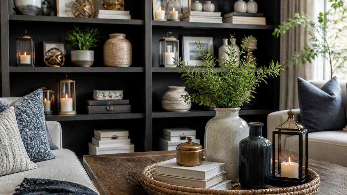
Scale means mixing sizes. Never group three identical-sized objects together. Use one large piece, one medium piece, and one small piece. This creates visual movement and prevents monotony.
Repetition means echoing shapes or colors. If you place a blue pillow on your sofa, repeat that blue in a vase or artwork elsewhere in the room. If you use brass accents on a lamp, add brass in a picture frame or decorative object. Repetition ties the room together.
Placement follows the rule of odd numbers. Group items in sets of three or five, not two or four. Arrange them at different heights. Don't line everything up in a straight row. Stagger your pieces. This looks intentional and designed.
Here's a practical framework:
- Coffee table: one tall piece (vase), one medium piece (stack of books or decorative box), one small piece (candle or small sculpture)
- Bookshelf: alternate books with decorative objects. Group items in clusters of three at varying heights.
- Side table: one statement piece (the brass vase from Downtown5), one functional piece (a lamp), one small accent (a candle or plant)
- Wall displays: hang artwork and mirrors at different heights. Leave breathing room between pieces.
The large decorative lanterns at Downtown5's lantern collection work beautifully in layered displays because their pear shape and gray color complement both modern and traditional aesthetics, and their size makes them strong anchor pieces in grouped arrangements.
Common Mistakes When Mixing and Matching Accent Pieces
Most people make the same errors when learning how to mix and match home accent pieces. Knowing these mistakes helps you avoid them.
Mistake 1: Matching everything exactly. A room where all pillows match, all metals match, and all wood tones match feels sterile. It lacks personality. Instead, aim for harmony through color and material balance, not identical matches.
Mistake 2: Forgetting about scale. Tiny accent pieces get lost. Oversized pieces overwhelm. If your sofa is large and modern, pair it with accent pieces that have presence. A small delicate vase disappears next to it.
Mistake 3: Ignoring negative space. Empty space is not wasted space. It lets your accent pieces breathe. Cramming every surface with objects makes a room feel cluttered, not curated.
Mistake 4: Mixing too many colors. Stick to your three-color palette. If you add a fourth or fifth color, your room loses cohesion. Every new color should serve a purpose and appear at least twice in the room.
Mistake 5: Placing all accent pieces at eye level. Vary the height of your displays. Put tall pieces on the floor. Hang artwork higher on walls. Place small objects on shelves at different levels.
Mistake 6: Forgetting about proportion. A tiny end table next to a massive sofa looks wrong. A delicate side chair in a room full of chunky furniture feels out of place.
Room-by-Room Application: Bringing It All Together
Different rooms need different approaches. Here's how to apply these principles in the spaces where you actually live.
Living Room: Start with your sofa as the anchor. Choose your main color from the sofa's color. Build your secondary color and accent colors around it. Layer your coffee table with three pieces at varying heights.
Bedroom: Keep it calm by limiting your accent colors. Your main color should dominate. Use your secondary color in bedding and curtains. Add accent color sparingly in pillows or wall art.
Kitchen and Dining: Open shelving is your friend here. Group dishware, glasses, and decorative objects together. Repeat your color palette through cookbooks, pottery, and small accessories.
Entryway: This is where first impressions happen. Layer a console table with a mirror, a decorative object, and a small plant or vase. Add a wall-mounted shelf with grouped items. Keep it intentional and uncluttered.
Home Office: Balance function with style. Your desk is functional. Your accent pieces are personal. Add a vase with dried flowers, a decorative object on a shelf, and artwork on the wall.
The handwoven throw pillow cover at Downtown5's textile collection brings warmth and texture to any room.
Learning how to mix and match home accent pieces is about building confidence in your own taste. Start with a clear color palette and style direction. Layer pieces at varying scales and heights.
Frequently Asked Questions
What's the best way to choose accent pieces that work together?
Start by identifying your dominant and secondary decorating styles, then select a main color palette with one primary, one secondary, and one accent color. Choose accent pieces that repeat at least two of these colors or materials across your room. For example, if your main color is neutral and your accent is brass, select vases, lanterns, and smaller accessories that feature brass or complementary metals. This repetition creates visual cohesion without requiring exact matches.
How do I avoid a cluttered look when mixing and matching patterns?
Use the principle of scale variation: pair one large-scale pattern with smaller, more subtle patterns. Separate different patterns with solid-colored pieces or neutral furniture. Limit yourself to three patterns maximum in one room, and ensure they share at least one color. For instance, a geometric throw pillow works well alongside a striped accent piece if both feature your secondary color. This prevents visual chaos while maintaining interest.
Can I mix materials like wood, brass, and ceramic without it looking mismatched?
Yes, mixing materials creates depth and personality. The key is repetition and balance. If you introduce brass through a vase or lantern, repeat it elsewhere with another brass accent piece. Similarly, use wood in multiple places, a bookshelf, side table, and picture frame. Ceramic works well as a bridge material. For example, a handmade ceramic vase pairs beautifully with brass accents and wooden furniture because it complements both without competing. Aim for at least two instances of each material in your room.
How do I know if my accent pieces are the right size for my space?
Scale matters: larger pieces anchor a room and work best on focal points like shelves or side tables, while smaller accessories fill gaps and add detail. A large decorative lantern works as a statement piece near an entryway, while smaller vases cluster on a bookshelf. A good rule is to vary heights and sizes, group a tall vase with medium and small pieces to create visual rhythm. Avoid placing all large pieces together or all small ones, which can feel disjointed.