

Creating a Cohesive Home Interior Style: 2026 Guide
Table of Contents
- Why a Cohesive Home Interior Style Matters in 2026
- Start With a Design Compass: Define Your Personal Style
- Interior Design Color Palette Tips for a Unified Look
- Interior Design Mood Board Examples to Plan Your Space
- How to Mix Design Styles Without Creating a Hodgepodge
- Repetition, Texture, and Architectural Details That Tie Rooms Together
- Budget-Conscious Cohesion: Making It Work on a First-Apartment Budget
- Frequently Asked Questions
Last Updated: September 12, 2026
Why a Cohesive Home Interior Style Matters in 2026
Creating a cohesive home interior style is the practice of tying every room together through repeated colors, materials, and shapes so a space feels intentional rather than assembled at random. According to Homestyler's 2026 search trend analysis, which reviewed 10,587 search trends across 26 markets, this year's interiors are defined by "intention," with homeowners chasing rooms that feel warm and human-centered. This guide from Downtown5 breaks that down into eight practical moves you can copy this weekend. Get it right and your apartment looks designed. Get it wrong and you've spent real money on a hodgepodge.
The stakes are higher than most people admit. Design analysis for 2026 points to clarity and personal storytelling as the primary route to cohesion, replacing the cluttered, match-everything aesthetic of the past decade (Reimagine Home's 2026 trend report). That shift favors renters and first-time buyers: fewer, better pieces, chosen on purpose.
Start With a Design Compass: Define Your Personal Style
A design compass is a written one-page rulebook for your home: three adjectives, two core colors, one metal, and one material you'll repeat. Most people skip this step and wonder why their rooms fight each other. Write yours before you buy anything else.
Ask yourself what you actually want to feel in each room, then translate it into specifics:
- Calm and quiet: warm white walls, oatmeal linen, light oak, brushed nickel
- Warm and collected: cream walls, rust and olive accents, walnut, aged brass
- Crisp and modern: soft gray walls, charcoal and camel, black metal, matte ceramic
Keep the list to a single index card. The tighter the constraints, the faster every future decision gets, and the less likely you are to bring home a piece that doesn't belong.
Interior Design Color Palette Tips for a Unified Look
The fastest route to a unified look is a restrained palette: one dominant neutral, one secondary tone, and one accent you use sparingly. Interior design color palette tips that actually work all share the same backbone, which is fewer colors used more deliberately. That said, don't force every piece to match. The team at Room for Tuesday has argued that overly "matchy" rooms lose character and depth, and they're right. Cohesion comes from harmony, not uniformity.
The 60-30-10 Rule in Practice
The 60-30-10 rule splits a room's color into three shares: 60% dominant neutral (walls, large upholstery), 30% secondary tone (rugs, curtains, case goods), and 10% accent (pillows, art, small ceramics). Applied to a living room with a $310 budget for the floor layer, that means a neutral-dominant rug with blue and beige in the pattern does the heavy lifting while accent hues stay small and cheap to swap.
Anchoring that 60% is easier when the base itself is beautiful. Downtown5's Rugsotic hand knotted silk area rug in blue and beige covers both the dominant and secondary shares in one purchase, so the rest of the palette only has to echo it.
Interior Design Mood Board Examples to Plan Your Space
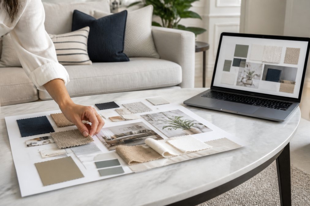
A mood board is a single visual reference that collects your colors, materials, and reference images before you spend money. Interior design mood board examples range from a pinboard of fabric swatches to a digital file on your phone, but the function never changes: it forces you to see whether your choices agree with each other. What most guides skip is the tooling, which app to open, what to put in each slot, and how to keep the board honest once you start buying.
Digital Tools That Actually Speed This Up
You do not need design software. A free notes app (Apple Notes, Google Keep) handles a starter board, but dedicated tools cut the busywork:
- Pinterest, best for the first pass. Create one secret board per room, then a master board where you pin only the images that appear in two or more rooms. The overlap is your palette.
- Canva, free tier is enough. Use the grid template, drop in swatches and screenshots, and export a single image you can text to a partner.
- Coolors, generates a five-color palette from a photo of a rug or painting. Useful when you have a hero piece and need the secondary and accent tones to match it.
- Roomstyler and Planner 5D, free floor-plan tools. Upload room dimensions, drop in furniture footprints, and check scale before you buy. This catches the most expensive mistake: a sofa that fits the mood board but not the doorway.
- Sherwin-Williams ColorSnap Visualizer and Benjamin Moore Personal Color Viewer, upload a photo of your actual room and test paint colors in your own light. Paint chips lie under store fluorescents; these tools do not.
A common pattern is to run Pinterest for inspiration, Coolors for the palette, and one floor-plan tool for scale, then consolidate everything into a single Canva board. That board becomes the document you shop against.
Physical Boards Still Earn Their Place
Digital boards win on speed and price: you can build one free in a notes app, share it with a partner, and edit it in seconds. Physical boards win on honesty, because a paint chip in your actual afternoon light tells the truth in a way a screen never does. The practical answer is to do both, using digital for the first pass and a small physical board for the final three or four samples.
Build the physical version in twenty minutes:
- Pick your three adjectives from the design compass
- Clip or print five images of rooms that match them
- Tape your two core colors as paint chips or swatch photos
- Add one material close-up (wood grain, linen weave, stone)
- Lay everything side by side and remove anything that clashes
Woodgrain's 2026 interior trend analysis notes that wood tones, architectural millwork, and sculptural silhouettes are leading the way designers create depth this year, so include at least one wood sample on your board even if your palette is cool.
How to Mix Design Styles Without Creating a Hodgepodge
Mixing styles works when one style dominates at roughly 70% and the second plays a supporting role at 30%. The failure mode isn't mixing, it's mixing evenly, which produces the hodgepodge everyone fears. Learning how to mix design styles is really learning how to assign hierarchy. But the part almost no guide explains is the transition, how two styles hand off from one room to the next without a hard stop at the doorway.
Finding Common Threads Between Styles
Every pairing has a bridge if you look for it. Find the common threads first, then let the two styles meet there:
- Mid-century and industrial: black metal and warm walnut
- Coastal and traditional: linen, natural fiber, and soft blue
- Modern and rustic: matte black hardware and raw oak
- Boho and minimalist: cream, clay, and one sculptural shape
- Farmhouse and contemporary: white shaker lines and warm brass
Transitioning Between Styles Room to Room
A home where the living room is fully mid-century and the bedroom is fully industrial reads as two apartments sharing a wall. The fix is a transition zone, usually a hallway, an entry, or the shared wall between two rooms, where the two styles overlap before either one takes over.
Three mechanics make the handoff work:
- Carry one material across the threshold. If the living room is walnut and the bedroom is black metal, put a walnut-and-black-metal console in the hallway. The eye reads it as the bridge, not a third style.
- Shift the ratio gradually. Living room at 90/10 mid-century, hallway at 70/30, bedroom at 30/70. The percentages move in steps, not a jump.
- Repeat the palette, change the forms. Keep the same two colors in both rooms, but let the shapes change. Color is the thread; silhouette is the style.
When the Two Styles Are Yours and Your Partner's
Mixing tastes is the same problem with higher stakes. A workable pattern is to assign each person one room to lead and one shared room to co-design. In the shared room, each person picks one anchor piece, and the palette is built around whichever anchor is larger. The smaller anchor becomes the accent. This gives both people a visible win without splitting the room down the middle.
Repetition, Texture, and Architectural Details That Tie Rooms Together
Repetition is the mechanism that makes cohesion visible. Repeat a color, a shape, or a finish at least three times across a home and the eye reads it as a design motif rather than an accident. Texture and architectural details do the rest of the work.
Start with the elements that are cheapest to repeat:
- Metallics: commit to one finish for hardware, lamps, and frames
- Door profiles and wall treatments: consistent trim reads as intentional
- Built-ins: repeated shelving or millwork creates a design language across rooms
- Fabric: carry one textile (linen, boucle, wool) through at least three rooms
Tobias, an interior design expert at House & Garden, puts the process plainly: House & Garden on trial-and-error placement "Embracing trial and error in order to find the perfect placement and alignment." Translation: expect to move things twice.
Lighting is the most underrated repetition tool. A single fixture family used in two or three rooms creates continuity faster than paint. Downtown5's 5-light black iron sphere chandelier and linen-shade floor lamp with remote control share a black-and-linen language that bridges modern, mid-century, and rustic rooms without a single repaint.


Budget-Conscious Cohesion: Making It Work on a First-Apartment Budget
Cohesion on a first-apartment budget comes down to spending on the pieces that repeat and saving on the pieces that don't. Most guides skip this entirely, which is why so many renters end up with a mismatched mess they can't afford to fix.
Here's the split that works:
| Priority | What to Buy | Typical Spend | Why It Matters |
|---|---|---|---|
| Repeat first | Area rug, lighting, throw pillows | $50-$310 | Appears in every photo, sets the palette |
| Repeat second | Wall treatment, hardware, frames | $30-$110 | Carries the motif room to room |
| Save | Art, ceramics, books, plants | Under $50 | Easy to swap when your taste shifts |
Peel-and-stick wall treatments are the cheapest architectural detail a renter can add. Downtown5's green marble peel-and-stick wallpaper at $110 turns one accent wall into a repeated color story, and it comes off without losing a deposit. Pair it with a handwoven throw pillow cover at $49.76 in warm fall tones, and you've built a palette for under $160.

One more thing worth knowing: cohesion is a spatial experience, not just a visual one. Rooms with a clear focal point and consistent scale feel calmer and easier to move through, which matters most in the small apartments where young professionals start out.
Building a cohesive home interior style is genuinely hard when you're furnishing a first apartment on a real budget, and the temptation is to buy whatever's on sale and hope it works. Downtown5 exists for exactly that problem: a curated selection of high-quality home goods, seamless shipping, and incredible value, so every piece you add actually belongs with the last one. Start with a rug or a light, build your palette around it, and let the repetition do the rest. Get started with Downtown5 and turn four disconnected rooms into one home.
Frequently Asked Questions
What is the 60-30-10 rule in interior design?
The 60-30-10 rule is a classic guideline for building a cohesive home interior color palette. Use your dominant color for 60% of the room (walls, large furniture), a secondary color for 30% (upholstery, curtains, rugs), and an accent hue for 10% (pillows, art, accessories). This ratio creates visual balance without feeling flat. For example, a room with 60% warm white walls, 30% soft beige furniture, and 10% green marble accents follows the rule naturally.
How do I mix different design styles without it looking cluttered?
Start by choosing one style as your base (say, modern) and layer in 20-30% of a second style (like rustic or mid-century). Look for common threads: shared wood tones, similar metal finishes, or a repeating shape. A black iron sphere chandelier, for instance, bridges industrial and modern styles because its open cage design feels both vintage and clean. Keep the palette tight, limit patterns to two or three, and let one piece be the focal point in each room.
Should every room in my house have the same color palette?
Not exactly the same, but they should relate. Use a consistent neutral base (warm white, greige, or soft beige) across all rooms, then vary the accent hues by space. The living room might lean into green marble and brass, while the bedroom uses linen and soft blue. This approach creates spatial harmony while giving each room its own character. The key is repeating at least one color or material from room to room so the eye connects them.
How can I make my home look cohesive on a budget?
Focus on repetition and a limited palette rather than buying everything at once. Choose one neutral base color for walls and large pieces, then add affordable accents like handwoven throw pillow covers or peel-and-stick wallpaper to introduce pattern and texture. Shop your own home first, move existing pieces between rooms, and invest in one or two statement items that tie the look together. Consistency in finishes and tones matters more than the price tag.
What are the best ways to create flow between open-concept spaces?
Use a continuous flooring material, repeat one color or texture across zones, and define areas with rugs rather than walls. Keep architectural details like door profiles and trim consistent. A floor lamp with a linen shade can bridge a living area and reading nook because its soft texture and neutral tone work in both. Avoid abrupt changes in style; instead, let one design motif (a shape, a metal, or a wood tone) appear in every zone.
How do I create a mood board for my home interior?
Gather inspiration from magazines, paint chips, fabric swatches, and digital tools like Pinterest or design apps. Arrange them to see how colors and textures interact. For interior design mood board examples, try a digital board with a neutral base, two accent hues, and three material samples. Physical boards help you feel texture, while digital boards are easier to edit. Include furniture silhouettes and lighting to test scale and proportion before buying.