

Avoiding Cheap Home Decor Mistakes: 2026 Guide
Table of Contents
- Why Your Home Looks Cheap (and How to Fix It)
- How to Make a Room Look Expensive on a Budget
- Choosing the Right Rug Size: Scale and Proportion Rules
- Interior Design Rules for Beginners: What to Know First
- Lighting Temperature and Layering Mistakes That Age a Room
- The Psychology of Clutter: Why Visual Noise Reads as Cheap
- Sustainable and Second-Hand Sourcing for a Curated Look
- Common Mistakes to Avoid When Avoiding Cheap Home Decor Mistakes
- Frequently Asked Questions
Last Updated: September 16, 2026
Why Your Home Looks Cheap (and How to Fix It)
Avoiding cheap home decor mistakes starts with understanding one principle: cheapness is rarely about price. According to House Beautiful's analysis of decor choices that make a space look tacky, designers consistently point to reliance on matching furniture sets and cookie-cutter room layouts as the primary factors that cheapen a home's aesthetic. At Downtown5, we see this constantly in customer photos: a room full of coordinated pieces that somehow feels flat.
The fix is not buying more expensive things. It is understanding scale, proportion, and restraint.
Most guides list mistakes without explaining the design theory behind them. That is a problem. Cheap home decor is a symptom, not a cause. The real issues are visual clutter, poor spatial flow, and a lack of texture layering. Below, we break down the specific mistakes and give you fixes that work on any budget.
How to Make a Room Look Expensive on a Budget
The fastest way to make a room look expensive on a budget is to focus on three things: lighting temperature, textile quality, and negative space. A single well-placed statement light or a high-quality throw pillow does more than ten small accessories.

Here is what actually moves the needle:
- Swap builder-grade light fixtures. Replacing a basic flush-mount with a statement pendant transforms a room instantly.
- Layer textures. Mix a linen sofa with a wool rug and a velvet accent chair. Uniform texture reads as flat.
- Edit ruthlessly. Remove one item from every surface. Negative space signals confidence.
Choosing the Right Rug Size: Scale and Proportion Rules
The right rug size is one that allows at least the front legs of all main furniture pieces to sit on it, with 12 to 18 inches of floor visible around the edges. An undersized rug is the single most common mistake that makes a room look cheap.
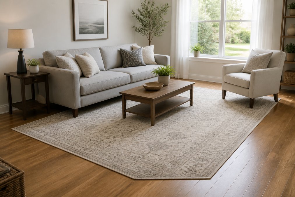
Industry guidance from The English Home's design principles emphasizes that skimping on rug scale and overcrowding rooms with small accessories are top mistakes that diminish perceived value. A rug that is too small shrinks the entire room visually. A rug that is correctly scaled anchors the furniture arrangement and creates a cohesive style.
For a standard living room, an 8x10 or 9x12 rug works for most configurations. In a dining room, the rug should extend at least 24 inches beyond the table on all sides so chairs stay on the rug when pulled out.
Interior Design Rules for Beginners: What to Know First
The most important interior design rule for beginners is this: design for your lifestyle, not for trends. Experts recommend focusing on personal utility rather than fleeting aesthetic fads to ensure a space remains relevant and high-quality. A common mistake is prioritizing aesthetics over functionality. Items chosen solely for looks often fail to provide long-term livability. That decorative bowl that looks perfect in the staging photo becomes a clutter magnet in real life.
But "design for your lifestyle" is only useful if you know how to translate it into decisions. Here are the beginner rules that actually prevent costly errors, with the mechanism behind each one.
1. Establish a focal point in every room, and build the layout around it. A focal point is the first thing the eye lands on when you enter: a fireplace, a large window, a statement piece of art, or a media console. The mechanism is visual hierarchy. Without a clear anchor, the eye bounces between competing objects and the brain reads the room as chaotic. Once you choose the focal point, orient seating toward it, keep the wall behind it relatively quiet, and let everything else support rather than compete. A common failure pattern is two focal points on opposite walls, a fireplace and a television, which forces furniture into an awkward split and makes the room feel unresolved.
2. Follow the 60-30-10 color rule, but understand what it is actually doing. Sixty percent dominant color (usually walls and large upholstery), thirty percent secondary (rugs, curtains, accent chairs), ten percent accent (pillows, art, small decor). The mechanism is proportion, not palette. The ratio works because it mirrors the way natural scenes distribute color: a dominant field, a supporting mid-tone, and a small high-contrast pop.
Sideboard Buffet Cabinet with Storage →
Lighting Temperature and Layering Mistakes That Age a Room
Lighting temperature is the color of light a bulb emits, measured in Kelvin. Most homes use a single overhead fixture at 4000K or higher, which creates the harsh, institutional look that reads as cheap.
Mismatched color temperatures in the same room is an instant cheap signal. If your ceiling fixture is 4000K and your table lamp is 2700K, the room looks disjointed. Pick one temperature per room and stick to it.
The Psychology of Clutter: Why Visual Noise Reads as Cheap
Visual clutter reads as cheap because the human brain interprets disorder as a lack of care. A room with too many small objects, exposed cords, and crowded surfaces signals that nothing has a designated place. But the mechanism runs deeper than tidiness, and understanding it changes how you edit a room.
The practical fix, in order of impact:
- Clear all surfaces completely, then add back only three items per surface. Group them in odd numbers and vary height, a tall object, a medium object, and a low object read as a composition rather than a collection.
- Hide cords with cable management or furniture placement. Exposed cords are one of the highest visual-weight items in any room because they introduce diagonal lines that the eye cannot ignore.
- Remove furniture that blocks natural walking paths. A useful test: can you walk from any doorway to any other doorway without turning your shoulders? If not, the layout is fighting the room.
- Dedicate one basket or bin per room for daily clutter catch-all. The goal is not zero objects, it is a designated place for the objects that accumulate, so the surface can be reset in under a minute.
- Apply the one-in-one-out rule to decor. Every new accessory that comes in should displace one that goes out, or the visual weight of the room creeps upward over time.
Sustainable and Second-Hand Sourcing for a Curated Look
Second-hand sourcing is the most underrated route to a curated aesthetic. Vintage furniture has patina and character that new mass-produced pieces cannot replicate. A solid wood dresser from a thrift store, refinished with a coat of paint and new hardware, looks more expensive than a flat-pack alternative.
The difference between a curated room and a cheap one is not budget. It is whether the pieces look collected over time or bought in one afternoon.
Common Mistakes to Avoid When Avoiding Cheap Home Decor Mistakes
The mistakes that make a home look cheap fall into a few clear categories. Here is a summary of what to watch for and how to fix each one.
| Mistake | Why It Reads as Cheap | The Fix |
|---|---|---|
| Matching furniture sets | Looks like a showroom, not a home | Mix eras and materials |
| Undersized rugs | Shrinks the room visually | Front legs of all furniture on the rug |
| Single overhead lighting | Harsh, institutional feel | Layer ambient, task, and accent light |
| Cold minimalism | Feels unfinished and empty | Add warmth with texture and wood tones |
| Faux greenery | Obvious and dated | Use real plants or high-quality preserved stems |
| Crowded surfaces | Signals lack of care | Three items max per surface |
| Blocking the flow | Disrupts spatial flow | Keep clear pathways |
Frequently Asked Questions
What are some common home decor mistakes to avoid?
Matching furniture sets, incorrect rug sizing, and poor lighting choices are among the most common cheap home decor mistakes. Designers also flag overusing cold minimalism and blocking natural pathways with furniture. Prioritizing functionality over pure aesthetics and avoiding trend-driven purchases help maintain a high-end look. Focus on scale, proportion, and texture layering instead of filling every corner with small accessories.
What makes a home look cheap?
A home looks cheap when furniture is too small for the room, lighting is purely overhead and harsh, and clutter replaces negative space. Faux greenery and matchy-matchy sets also contribute. The psychology of clutter plays a major role: visual noise signals a lack of curation. Choosing the right rug size and layering ambient lighting are two of the fastest fixes for avoiding cheap home decor mistakes.
What is the 3-5-7 rule in decorating?
The 3-5-7 rule is an interior design guideline for arranging accessories in odd-numbered groupings. Use three items for a small surface, five for a medium space, and seven for a large area like a console or shelf. Varying heights and textures within each group creates visual interest. This rule helps beginners avoid the trap of symmetrical, matchy-matchy decor that can make a room feel cheap.
How do I choose the right scale for furniture?
Measure your room's dimensions and note the pathway widths before buying. A sofa should occupy roughly two-thirds of the wall it sits against. For choosing the right rug size, ensure at least the front legs of all seating rest on the rug. Avoid overcrowding: leave 30 to 36 inches of walkway between major pieces. Scale and proportion matter more than quantity for a curated aesthetic.